Homepage
Lead with the promise, not the catalogue
The homepage opens on the mission and a single search-and-start path, then steps down into subject areas. Free is stated plainly and early, because it is the thing that changes a visitor's behaviour.
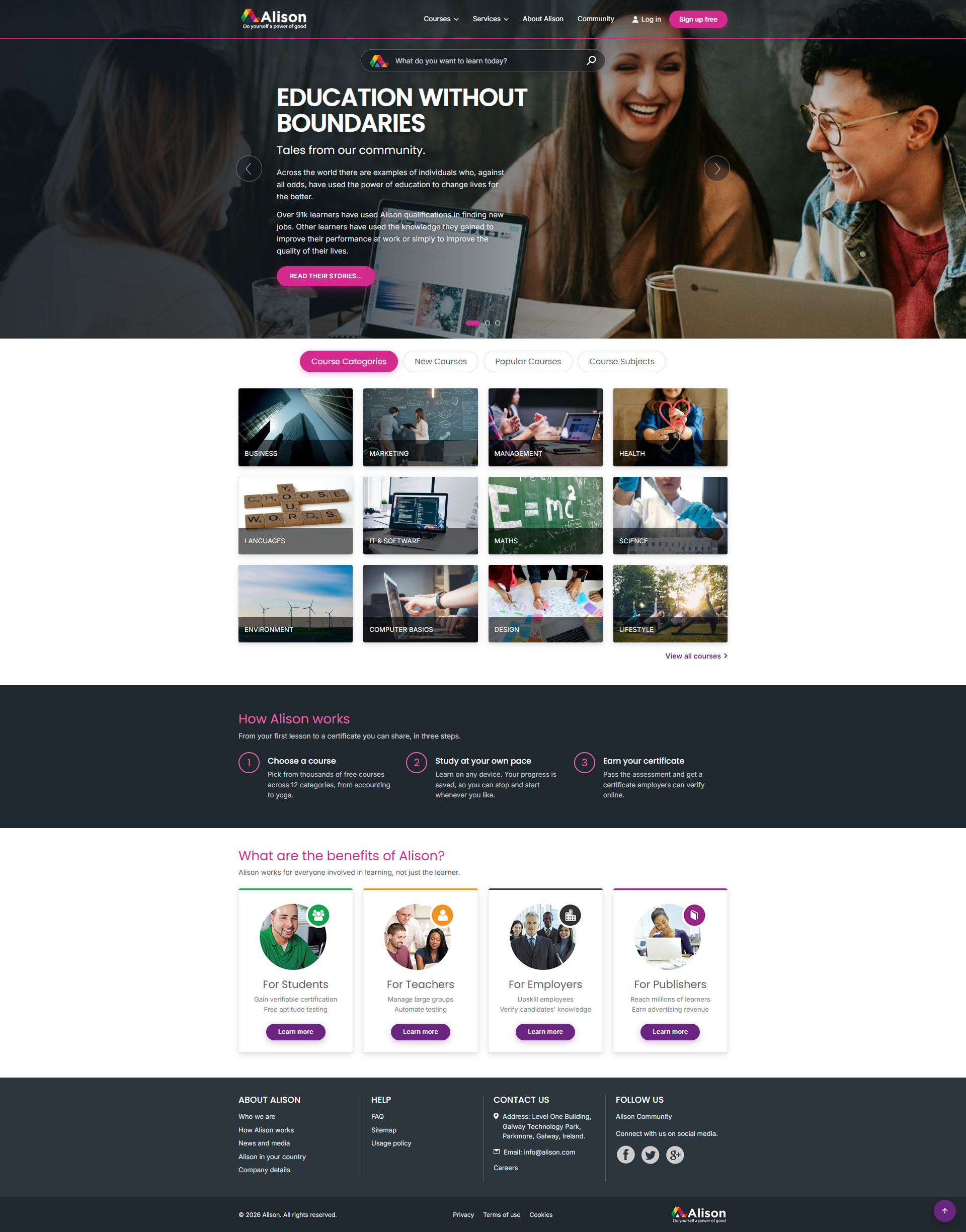
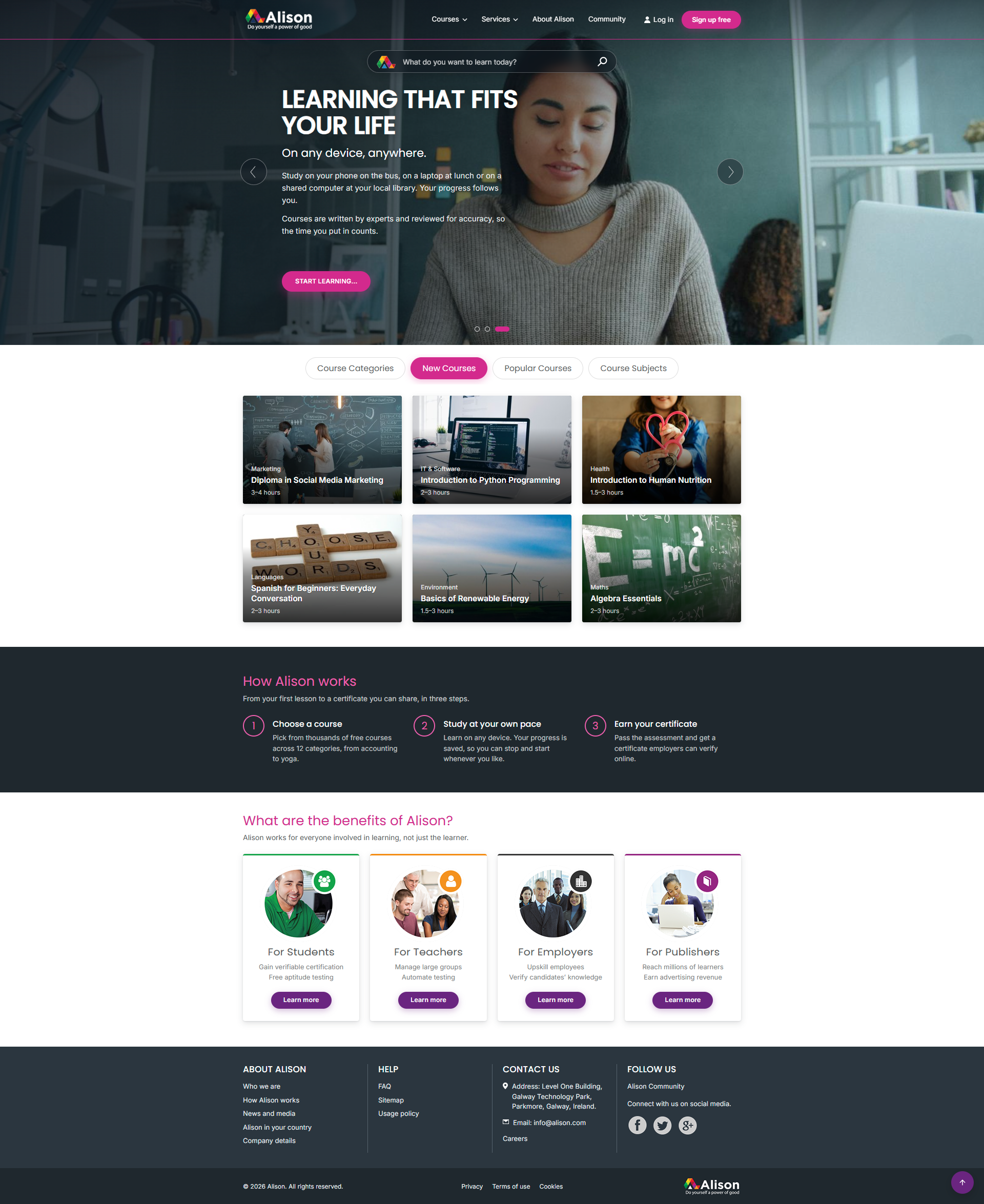

Rebranding one of the world's largest free learning platforms. A social enterprise built so anyone can study anything, anywhere, at any time, for free.
Alison had already grown into one of the largest free learning platforms in the world: millions of learners, thousands of courses, and a mission with real social weight. The brand around it had grown organically, in pieces, and no longer said any of that clearly. It read as a directory of courses rather than a catalyst for opportunity.
I was approached to lead the rebrand off the back of previous brand work and a working familiarity with the e-learning sector. The constraint was blunt. A complete rebrand and website relaunch inside six months, with a small stakeholder group, on a platform that could not stop serving learners while we changed it.
Working directly with a small group of stakeholders kept decisions fast and accountable. Rather than starting with logo options, we started with what Alison actually is: free, for everyone, at any level, anywhere. That single sentence became the filter for every design decision that followed.
The identity had to hold two things that usually pull apart: the credibility of formal education, and the openness of a platform with no paywall and no entry requirements. Too institutional and it excludes; too casual and the certification loses value.
Six months meant sequencing, not compromising. We locked the core (mark, palette, type, primary UI components) early and shipped it, then treated secondary applications as a rolling programme after launch. Deep IA restructuring of the course catalogue was deliberately scoped out of phase one so the relaunch date held.
The biggest judgement call was retaining enough visual equity that eight million existing learners would still recognise where they were on launch day, while shifting the brand's tone decisively.
Every mark, colour and component was tested against these. If it failed one, it was reworked rather than argued for.
01
Nothing in the visual language should suggest a gate, a fee or a prerequisite. The brand had to look like an invitation, not an institution.
02
Learners put Alison certificates in front of employers. The system needed the restraint and consistency that makes a credential believable.
03
Low bandwidth, older devices, dozens of countries. Contrast, weight and scale were set for the worst-case viewing condition, not the showcase one.
Alison Pink
#D32A8D
Plum
#6A2580
Slate
#21282E
Graphite
#2D353A
Achievement Green
#12A44A
Blush
#FBE9F4
The relaunched site had to convert a first-time visitor into an enrolled learner in as few decisions as possible, while still serving returning learners mid-course and employers assessing the certification.
Homepage
The homepage opens on the mission and a single search-and-start path, then steps down into subject areas. Free is stated plainly and early, because it is the thing that changes a visitor's behaviour.
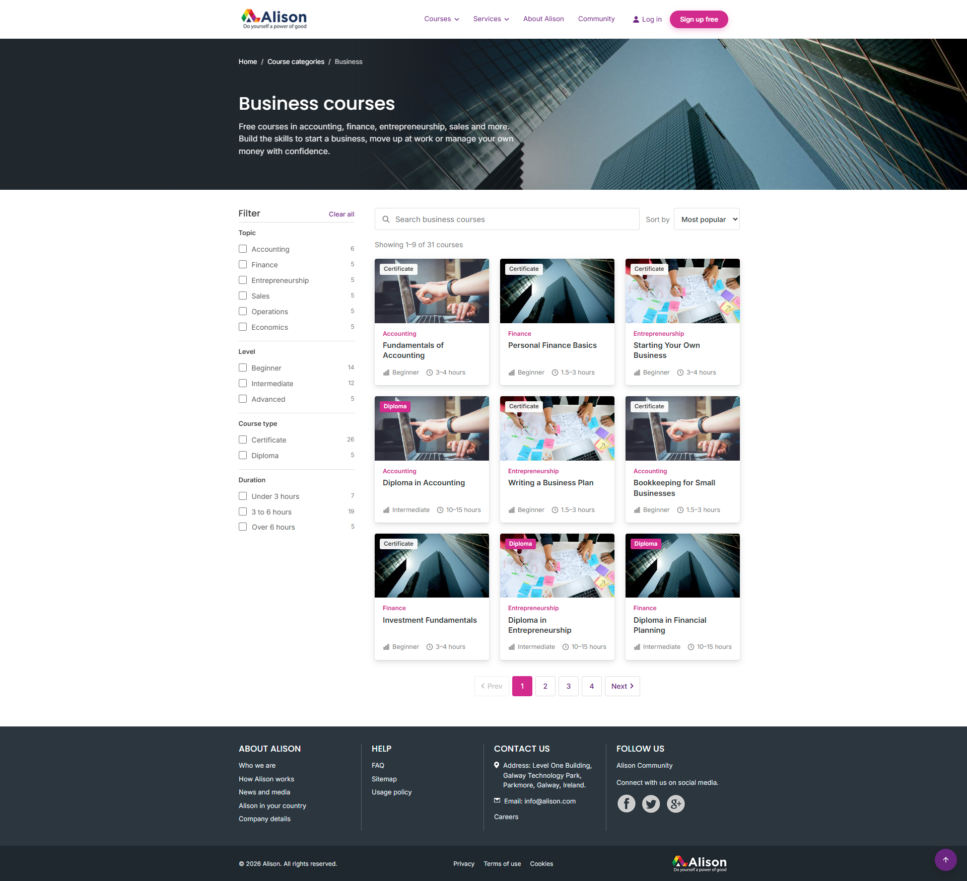
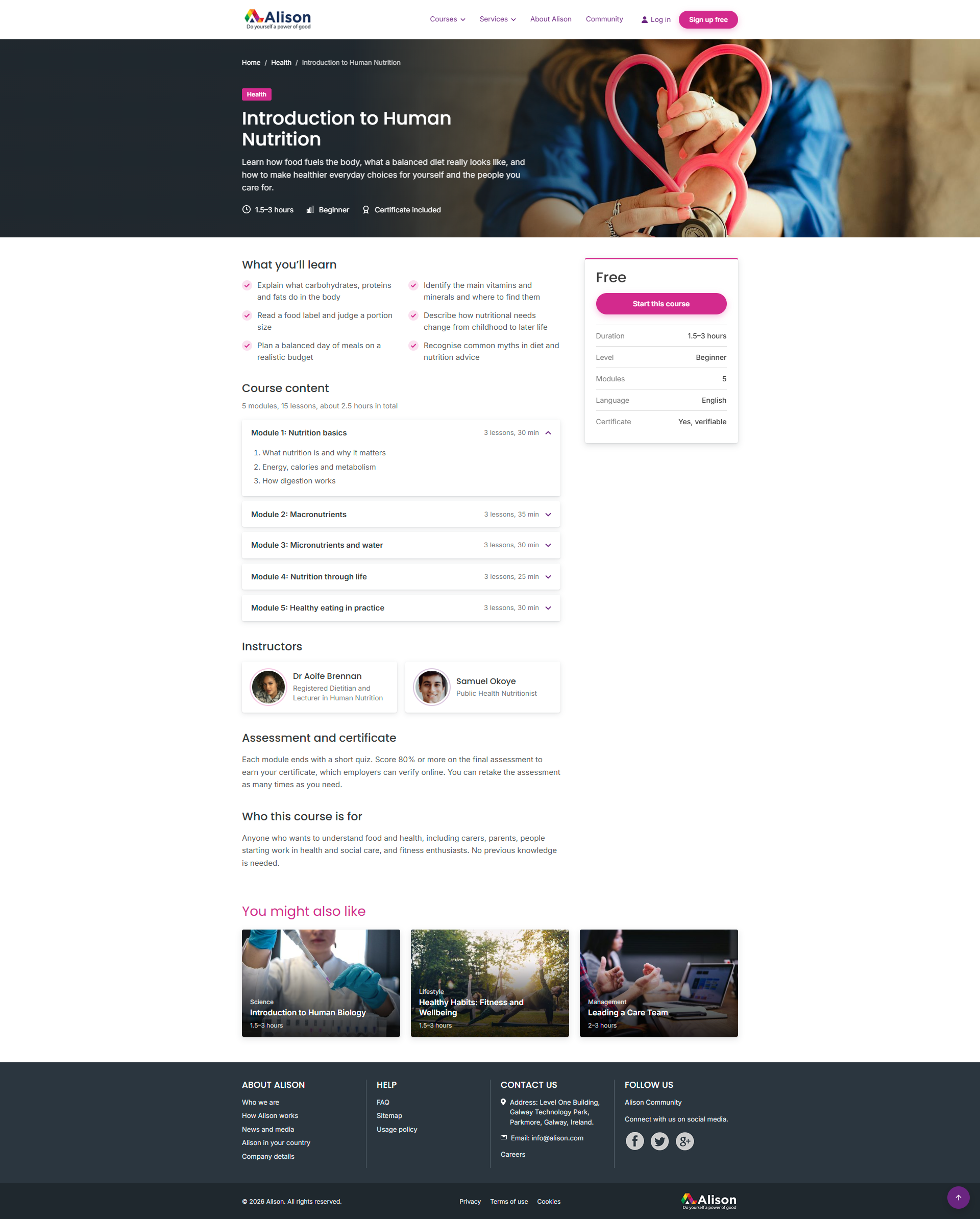
Courses
What will I learn, how long will it take, what do I get at the end, and what does it cost. Fixing that order across the catalogue removed most of the hesitation between browsing and enrolling.
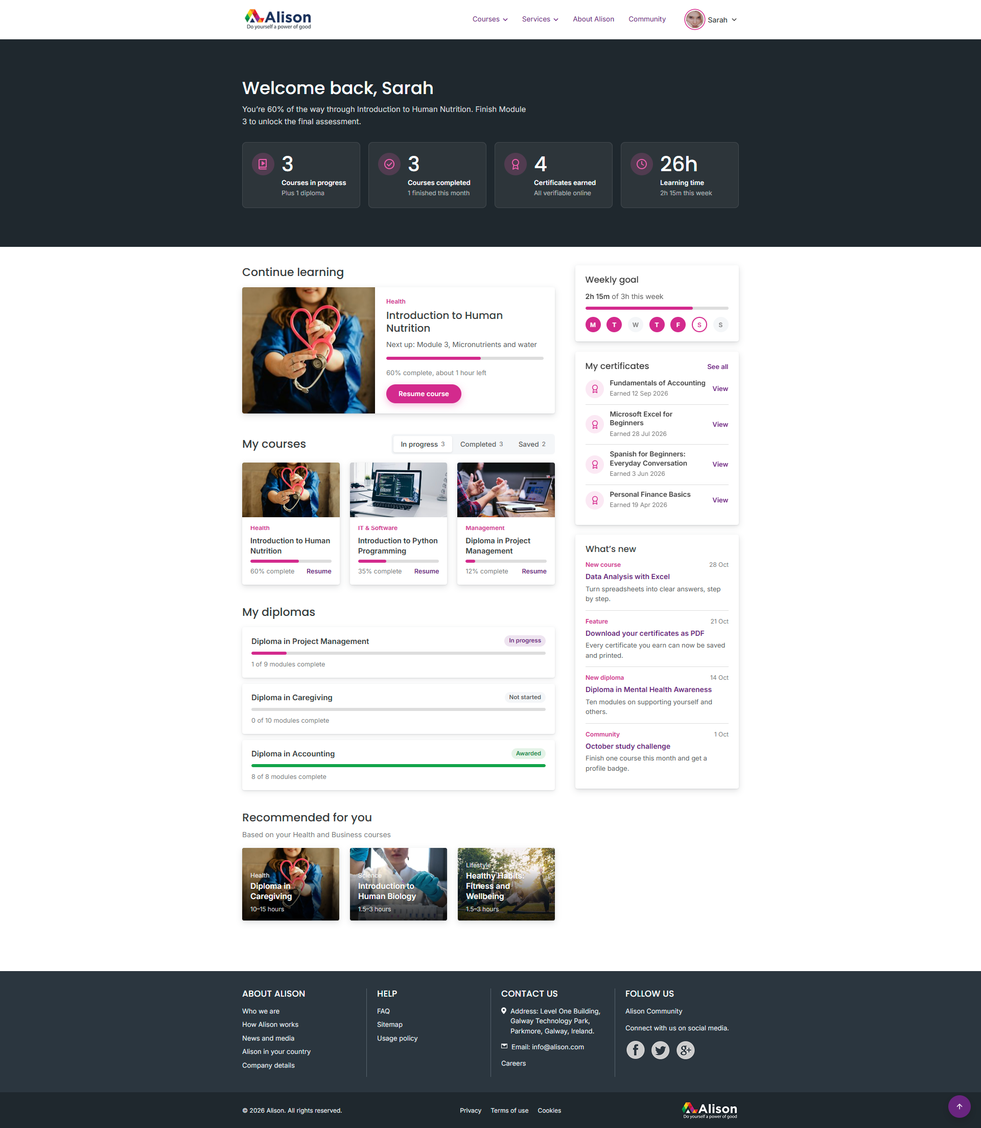
Learner Experience
For a free platform, completion is the hard problem. The learner views put progress, next step and certificate status in the same field of view, so returning learners always know exactly where to resume.
I judge a brand by its longevity. The Alison brand still stands, years on. Credit to its custodians and the people who make the company what it is.
Reflection