← Selected Works
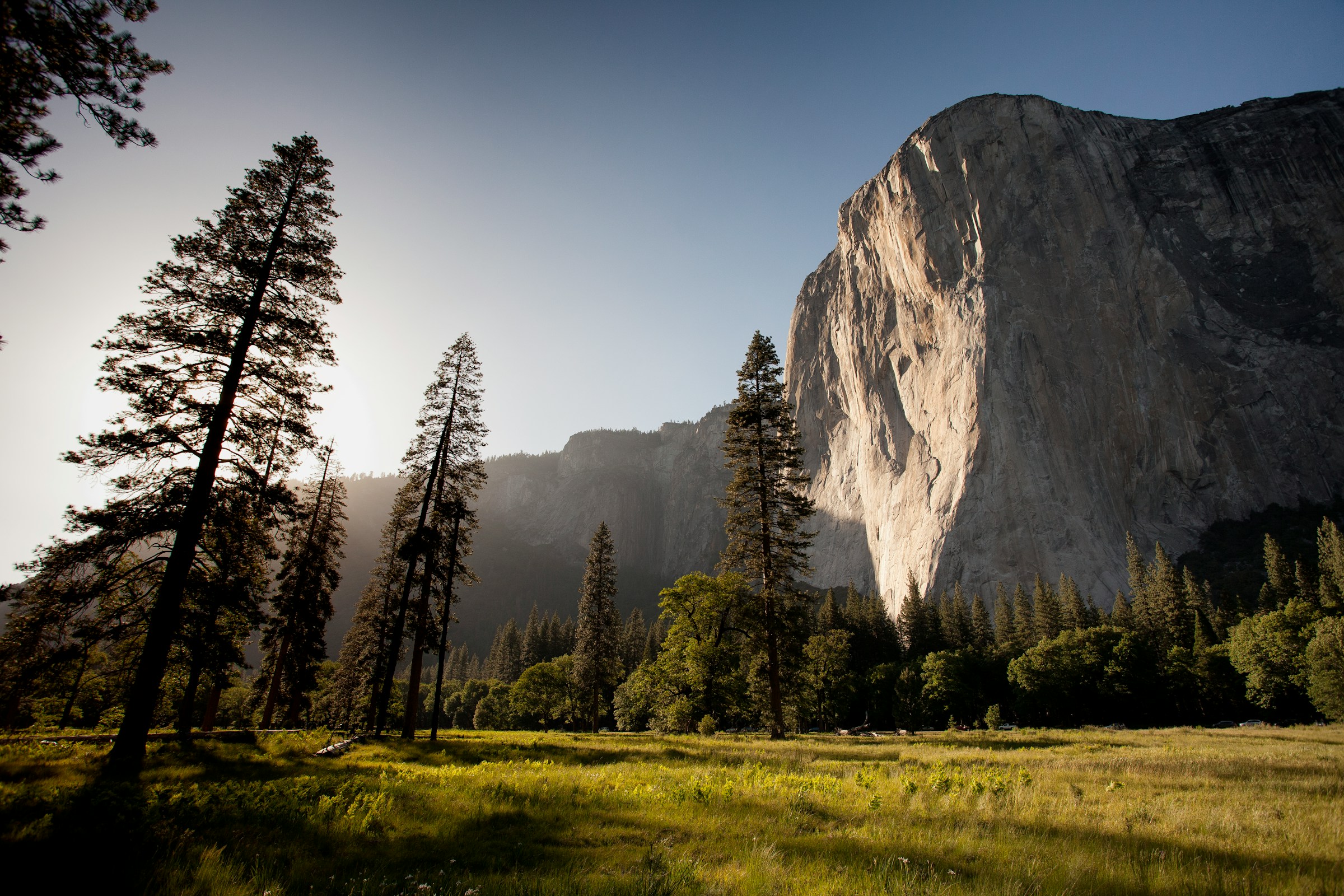
El Capitan rising above a sunlit meadow and pines in Yosemite Valley

Outdoorsie

A web app for booking guided outdoor experiences in California, from whitewater rafting and surfing to climbing, cycling and ski touring.

Product

Booking web app

Market

California, then North America

Role

Product & UX/UI Design

Outdoorsie is a web app for booking guided outdoor experiences in California. It starts in California, with a roll-out across North America to follow.

My role
Product & UX/UI Design across the booking journey: search and discovery, list and map browsing, experience pages, booking and checkout, and the account area, along with the Outdoorsie wordmark.
Product
Search, list and map browsing, experience pages with live availability, instant booking or request-to-book checkout, and an account area for upcoming and past trips.
Users
People booking a guided day outdoors, and the local guides who lead them.
The Challenge

Choosing a day outdoors means trusting a stranger with it.

Booking an outdoor experience is a bigger decision than booking a table. Before handing over a date and a card, people need to know where it is, how demanding it is, who is leading it, what is included and what happens if the weather turns. The product had to answer those questions quickly, for activities as different as a two-hour surf lesson and a three-day wilderness weekend.

The Approach

One consistent way to compare, choose and book.

Every experience is described the same way, from the card in search results to the full experience page, so price, duration, skill level, guide and booking type can be compared at a glance. People can browse as a list or on a map, and book instantly where a guide allows it or send a request where they don’t.

Brand Evolution

From early directions to the wordmark in the app

Two earlier directions and the final wordmark used across the product.

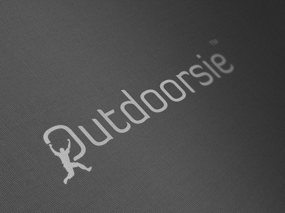
Earlier direction

Thin geometric capitals

An all-caps wordmark drawn in a single fine line.

Early Outdoorsie logo direction: thin, geometric all-caps wordmark
Earlier direction

A climber in the O

A lowercase wordmark with a climbing figure forming the first letter.

Early Outdoorsie logo direction: lowercase wordmark with a climbing figure forming the O
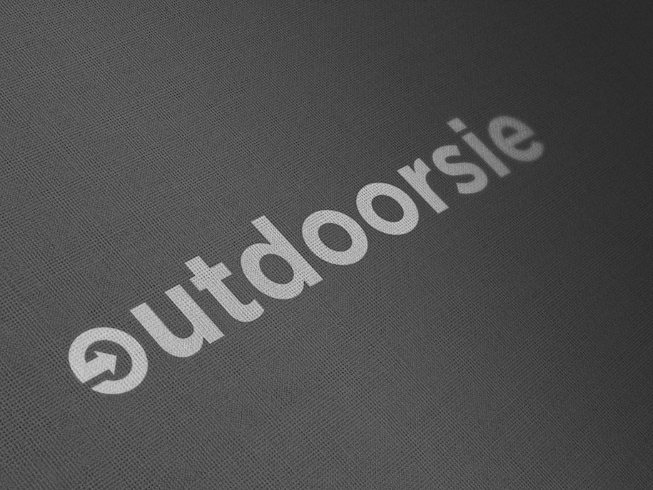
Final wordmark

An arrow through the o

A heavier, rounded lowercase wordmark with an arrow looping through the o, as used across the app.

Final Outdoorsie wordmark: rounded lowercase letters with an arrow looping through the o
The Product

From search to booked

Six screens across the journey: finding a trip, comparing options, deciding, booking and coming back.

Home

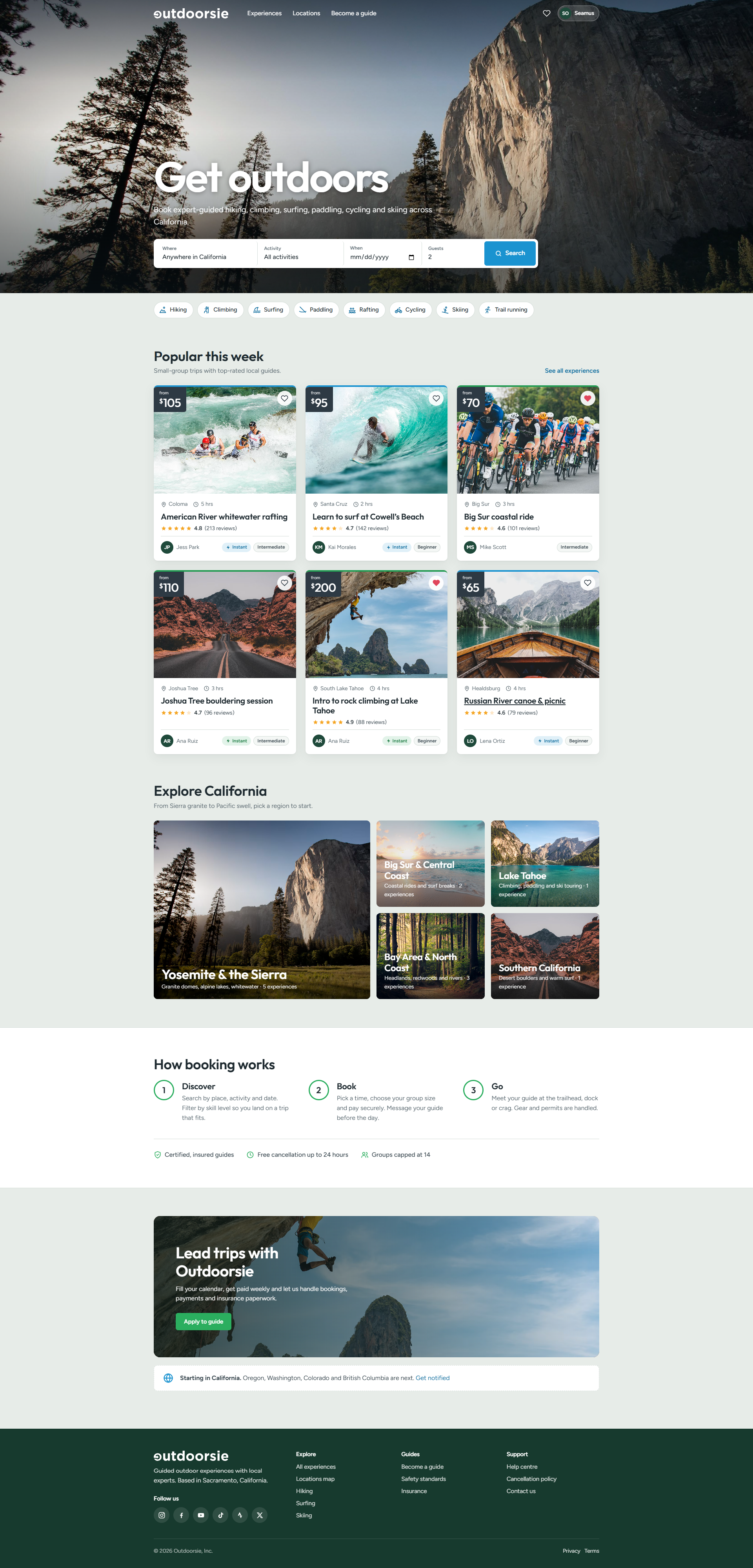
Start with where, what and when

The homepage leads with a single search for place, activity, date and group size, with activity shortcuts underneath. Below it, popular trips, the five regions and a three-step explanation of how booking works set expectations before anyone commits.

outdoorsie.com
Outdoorsie homepage: search by place, activity, date and guests, activity shortcuts, popular trips, regions and how booking works

Experiences

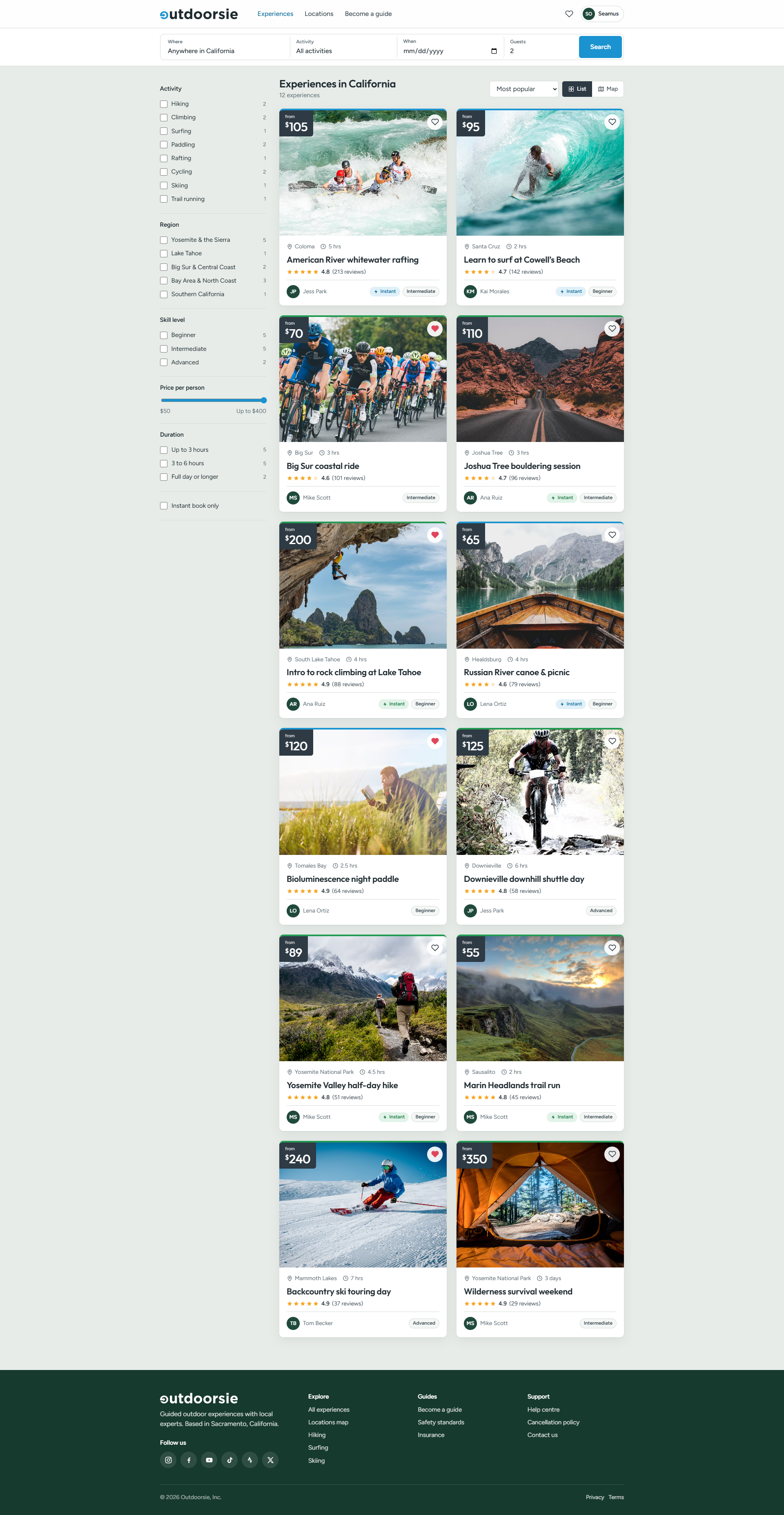
Cards that carry the decision

Each card shows what most people check first: the starting price, location, duration, rating and review count, the guide, the skill level and whether it can be booked instantly. Filters for activity, region, skill level, price, duration and instant booking show counts, so dead ends are visible before they are clicked.

Design decision

Comparing experiences. Outdoor trips are hard to compare once you are deep inside one listing. Putting the same facts on every card (price, place, duration, effort, guide, rating and booking type) lets people rule options in or out side by side before committing to any of them.

/ experiences
Outdoorsie experiences list with filters for activity, region, skill level, price, duration and instant book

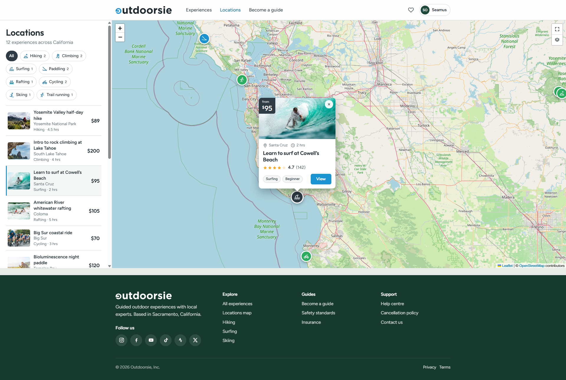
Locations

Browse by place

The map view lists experiences beside the map, with each pin marked by its activity. Selecting one opens a compact card with the price, rating, tags and a link through, so people can compare what is nearby without losing the map.

/ locations
Outdoorsie locations map with activity pins, a selected surf lesson card and a list of experiences

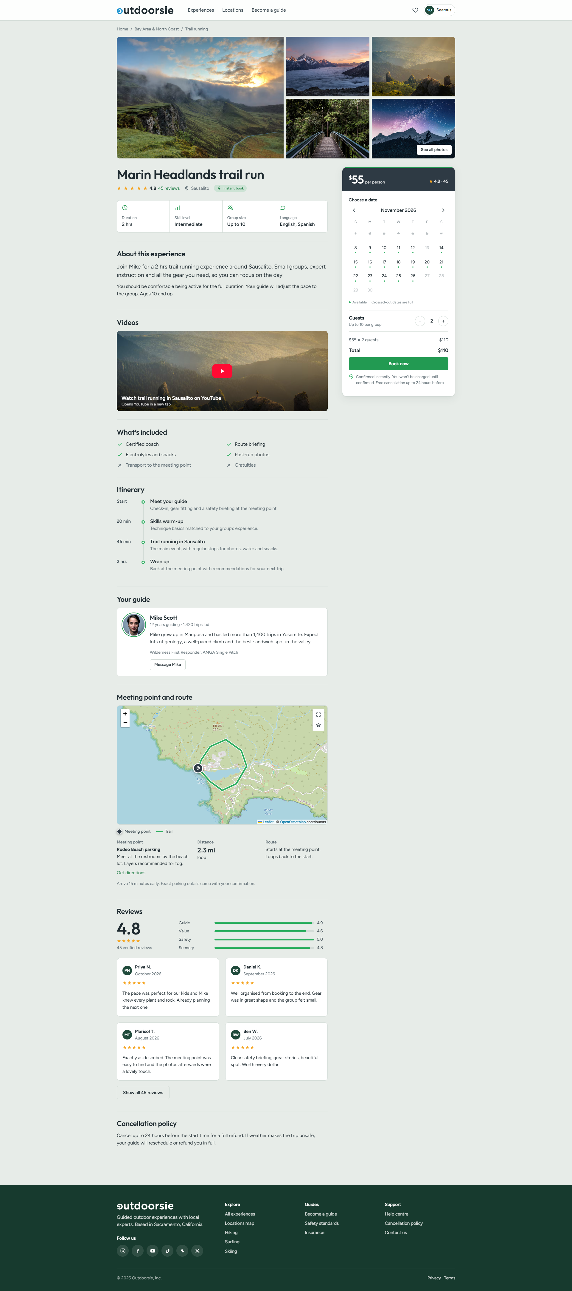
Experience

Answer the questions before they are asked

The page sets out duration, skill level, group size and languages up front, then what is and is not included, a timed itinerary, the guide’s background, the meeting point and route on a map, reviews broken down by guide, value, safety and scenery, and the cancellation policy. The booking card sits alongside with availability by date, a guest count and the total.

Design decision

Building trust before booking. Booking here means agreeing to a time, a place, a level of effort and a guide you have not met. The guide, itinerary, meeting point, group size, skill level, reviews and cancellation terms all appear before the booking card asks for anything, so people know what they are committing to.

/ experiences / marin-headlands-trail-run
Outdoorsie experience page for the Marin Headlands trail run, with booking card, itinerary, guide, meeting point map and reviews

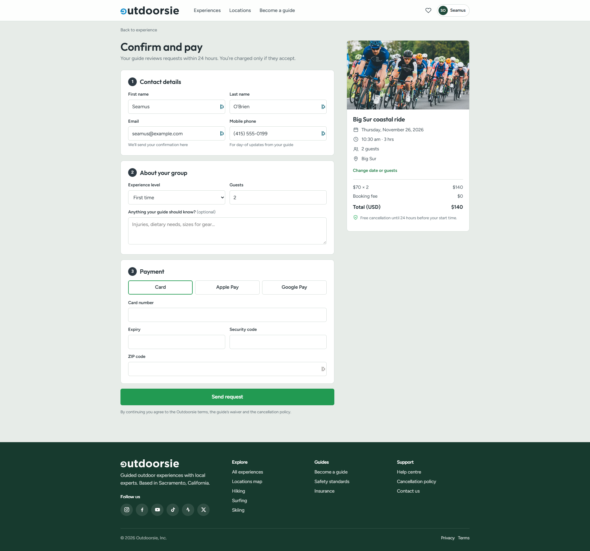
Checkout

Request to book, charged only on acceptance

For trips the guide confirms personally, checkout is a request: the page says plainly that the guide reviews it within 24 hours and that payment is taken only if they accept. Contact details, information about the group and payment sit in three numbered steps, beside a summary with the total, a zero booking fee and the free cancellation window.

Design decision

Two booking models, one journey. Some guides confirm instantly and others review each request, so the two models had to feel like one experience. Instant booking is tagged on cards and can be filtered for, so the model is clear before a trip is opened, and each path states plainly when payment is taken: on confirmation, or only once the guide accepts.

/ checkout
Outdoorsie checkout: contact details, group details and payment, with a booking summary

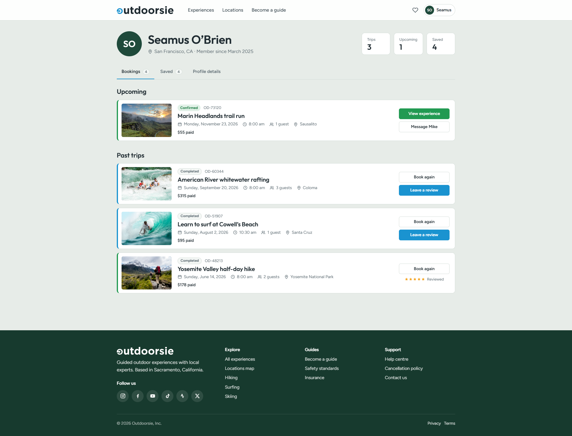
My bookings

Upcoming and past trips in one place

Upcoming bookings show their status, reference, date, time, group size and the amount paid, with a way to message the guide. Past trips offer Book again and Leave a review, and show the rating once a review is written.

/ account / bookings
Outdoorsie bookings page with an upcoming trip and past trips with book again and review actions

Mobile

The same journey on a phone

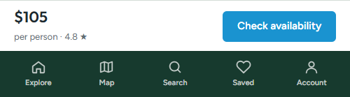
On a phone the search fields stack into a single column and activity shortcuts scroll sideways, with experience cards running full width. On an experience page the booking card becomes a price bar with a Check availability button, fixed above the navigation, and the rest of the page keeps the same order as on desktop.

Outdoorsie homepage on a phone: stacked search, activity shortcuts and full-width experience cards
Sticky bottom navigation: Explore, Map, Search, Saved and Account
Home
Experience
Where it goes next

Designed for California, structured for North America

Outdoorsie starts in California, with Oregon, Washington, Colorado and British Columbia named as the next regions. Regions, activities and experience pages all follow one pattern, so new areas can be added without redesigning the journey.

Project status: Product concept and prototype.

Get In Touch

Let’s craft something meaningful together.

Contact Me

© 2026 Design by Fergal Keane

Back to Selected Works ↗Privacy ↗