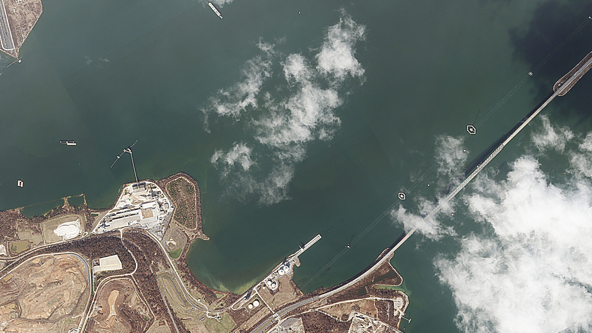
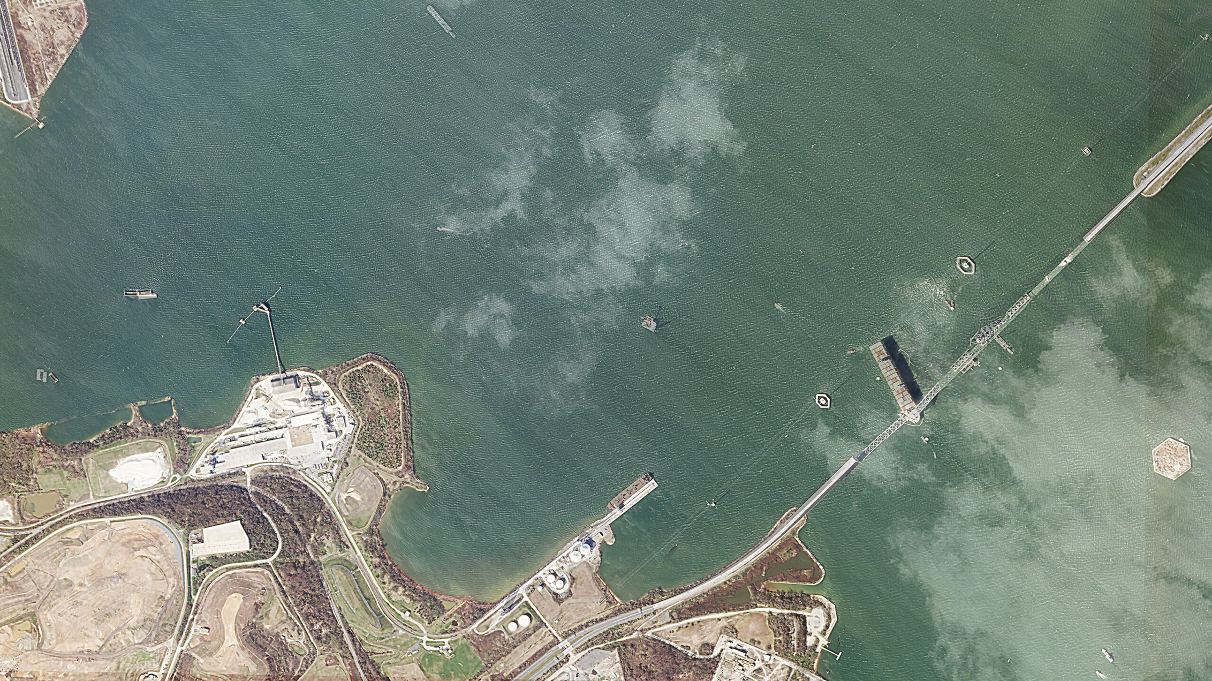
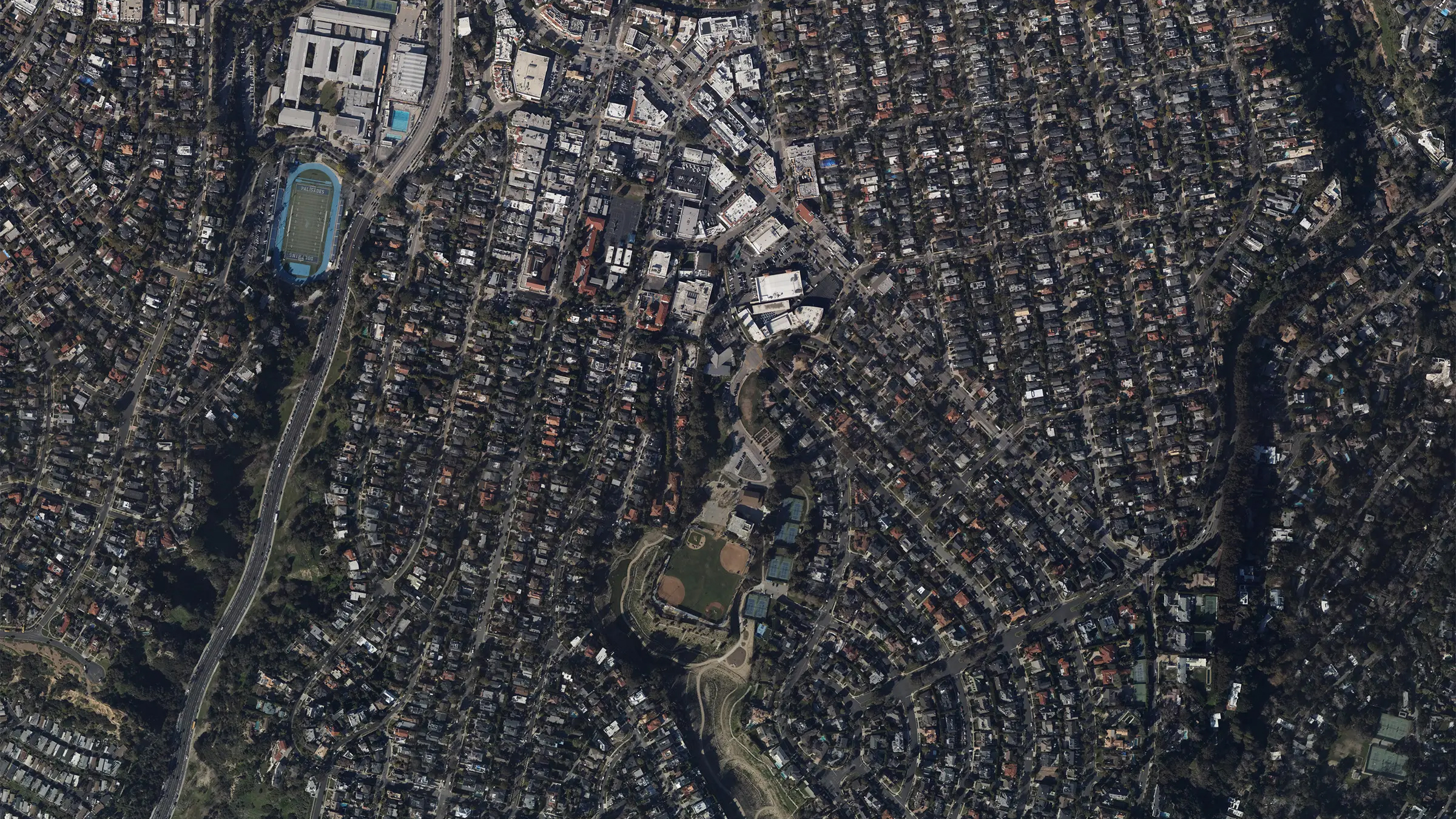
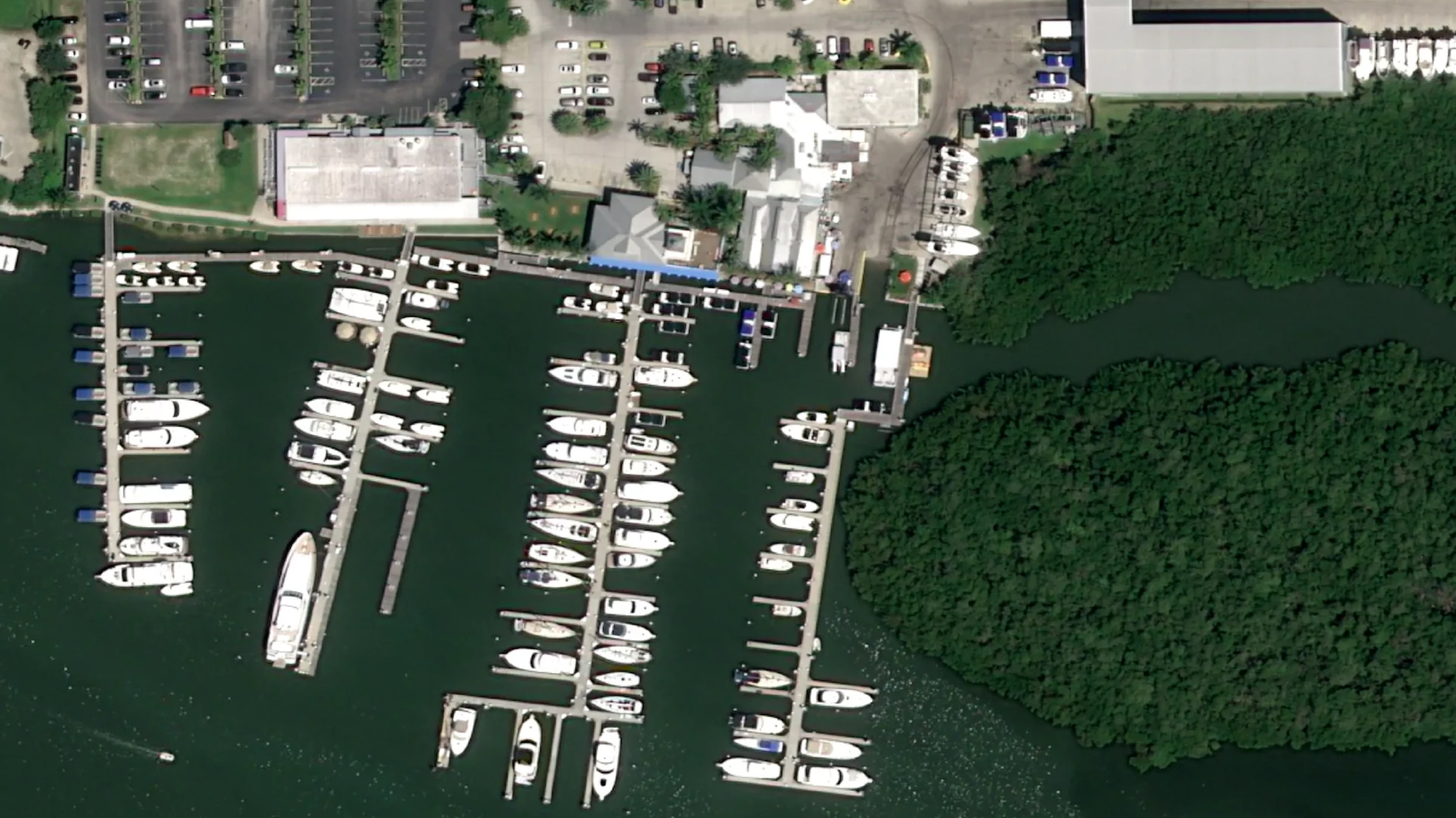
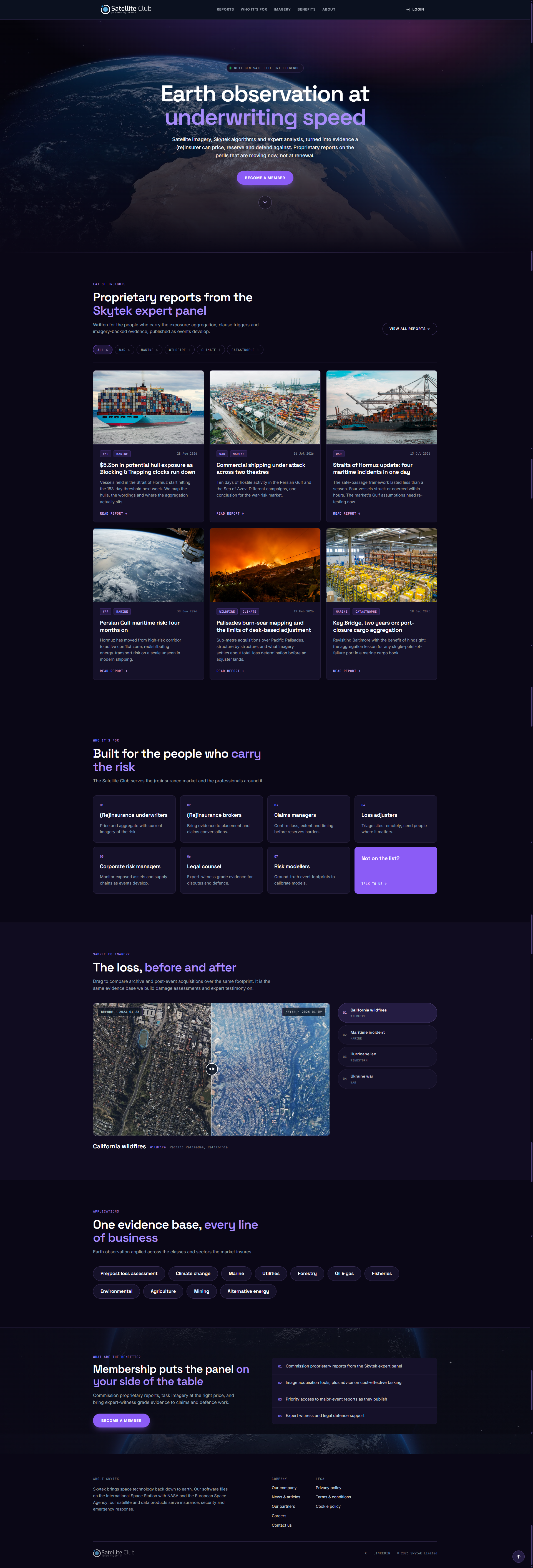
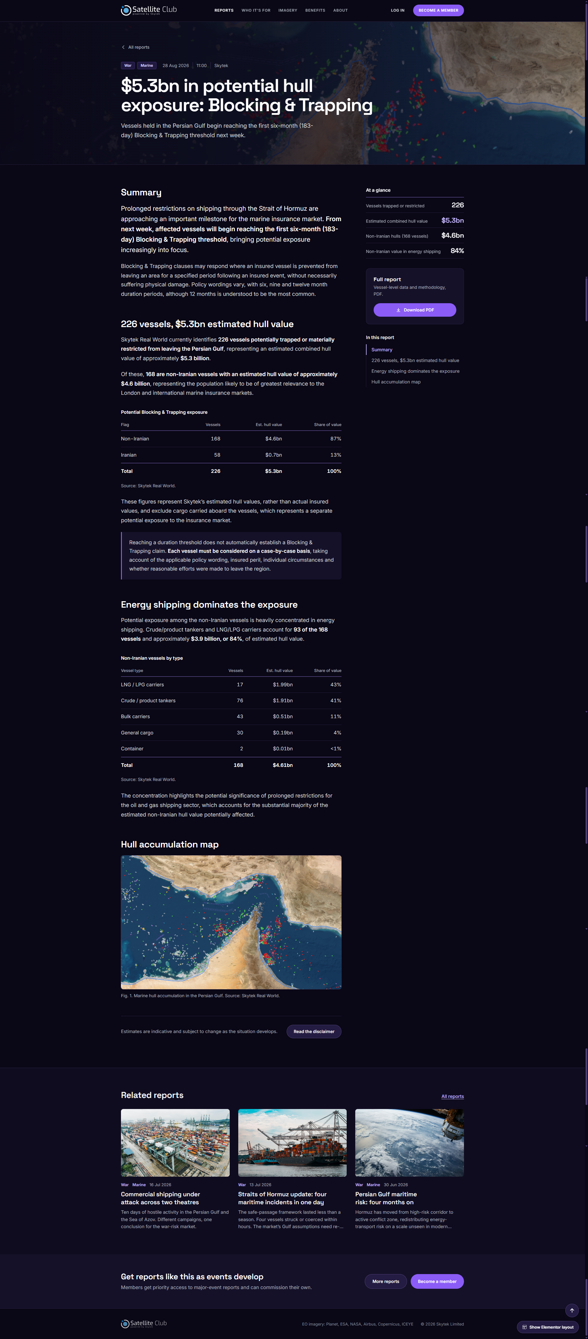
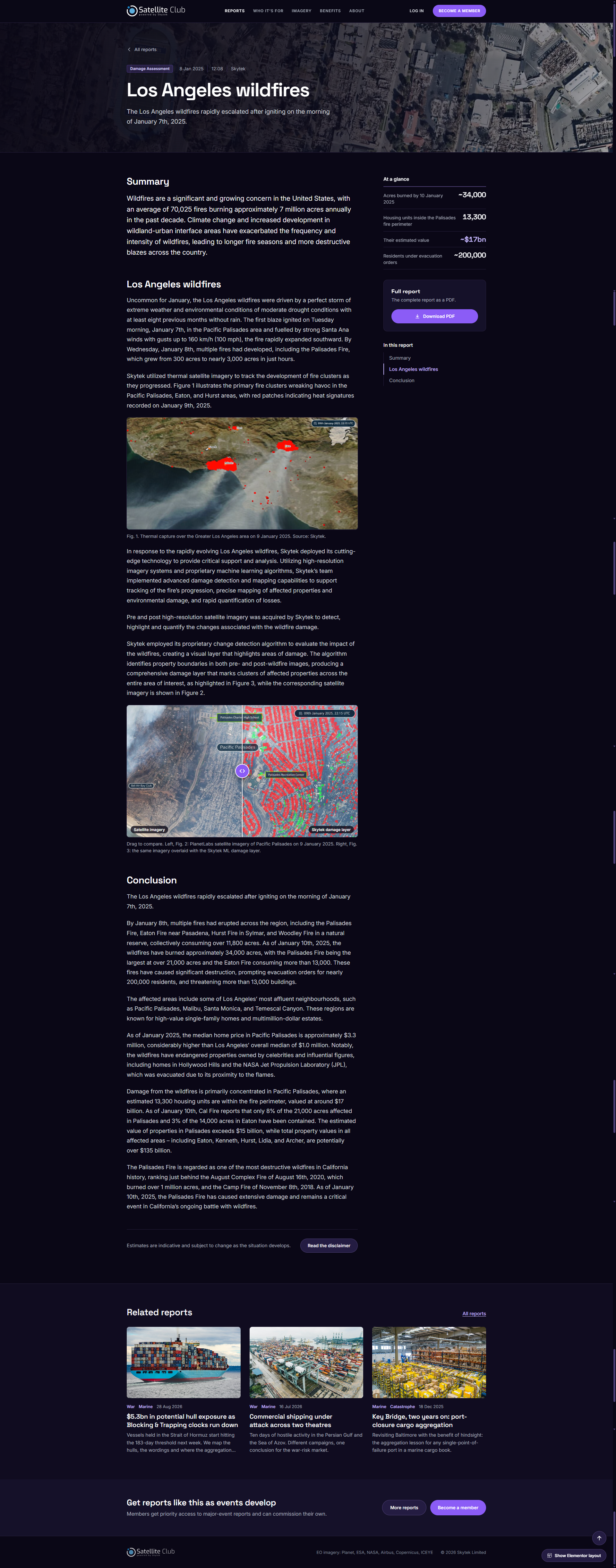
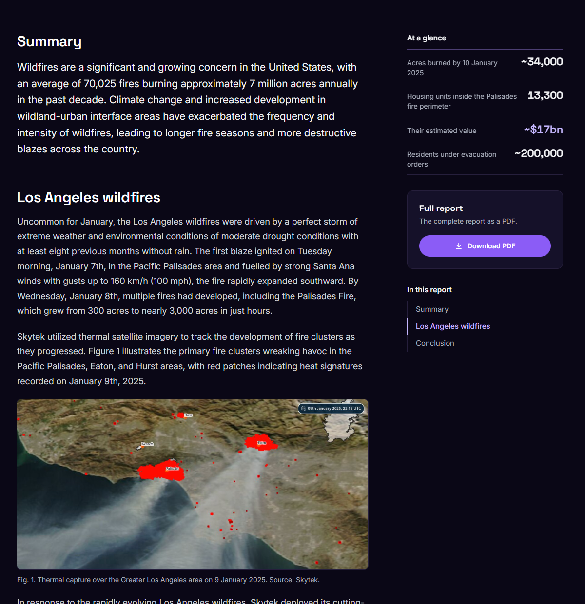
As Senior UX/UI Designer at Skytek, I shaped the Satellite Club product experience: how one platform serves two very different audiences, how the reports and imagery are structured and presented, and the interface and visual direction.
- My scope
- Product experience, information architecture, interaction design (including the before-and-after comparison and the login overlay), and interface design and visual direction.
- Product
- A members platform that turns Earth Observation into reports insurers can use. Imagery comes from six satellite data providers (Planet, ESA, NASA, Airbus, Copernicus and ICEYE) and the service covers eleven application sectors, so members get one point of access instead of a separate relationship with each provider.
- Users
- (Re)insurance professionals: underwriters, brokers, claims and loss teams, risk managers and modellers, and legal counsel.
The Problem
Space data the insurance market could not actually use.
The problem was access. An underwriter pricing a Gulf tanker risk, or a claims manager assessing a hurricane loss, does not want a data feed, a tasking request form or a GIS tool. They want a defensible answer about a specific location, quickly, in language that survives being put in front of a client or a court.
Framing
A membership, not a data subscription.
Members get commissioned proprietary reports from the Skytek expert panel, image acquisition tools, advice on cost-effective tasking, priority access to major-event reports, workshops, and expert witness support. That is a service, not a stream of imagery.
The framing also settled a positioning question. Sold as software, it competes with GIS platforms on features it does not want to compete on. Sold as a club with an expert panel behind it, the product is judgement, and the technology is how the judgement gets made.
The Hard Constraint
Two audiences, one page, opposite needs.
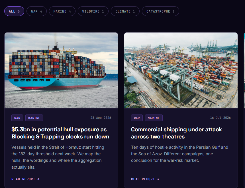
A first-time visitor needs to understand what Earth Observation does for their book of business. An existing member arrives looking for the report published this morning on the Strait of Hormuz.
Rather than splitting into a marketing site and a separate logged-in app, the page runs the proposition top-down and puts the live reports high on the same page. Login is a lightweight overlay rather than a destination, so a returning member never has to go through the pitch to reach the reports.